

Block & Tackle is John Teti’s column about pro football.
NBC Sunday Night Football: a graphical assessment
NBC’s Sunday Night Football graphics package could use a gentle refresh, but overall it’s a classy look. The score bar is clean and easy to read, even if the visual metaphor—something like an expensive man’s watch crossed with a Lincoln Continental instrument panel—is a little too “iOS 6” with its gloss and faux 3-D effects.
The font is great. I always look at the ampersand in football graphics because it’s a fidgety character whose grace (or lack thereof) gives you a good sense of the care that went into the overall type design. NBC gets high marks for an “&” that’s sophisticated without being stuffy, and I also appreciate the use of calm, readable lowercase letters. (The lettering on the gratuitous on-field down-and-distance marker, conversely, is a warped, undignified, all-caps shambles. That poor ampersand!)
There’s a cool spinning motion (highlighted in the GIF above) that unfurls on the score bar when NBC uses that area to display stats of interest. The sparkling, twirling peacock is a bit gaudy, but I have to admit that until I made that GIF today, I had never noticed that the peacock twirls, so it can’t be that distracting. Plus, the peacock is a fantastic logo. There’s no harm in letting it strut a little.
The look of Sunday Night Football’s detailed stat breakdowns is the best in the business. NBC heightens the sharpness and contrast of its player snapshots, which gives them a crisp, magazine-like feel. And they put subtle touches in the composition—here, for instance, it looks like Jay Cutler is thinking, “Screw this guy, I’m gonna throw some bombs,” which sounds about right. The text treatment is admirably restrained and flat. You don’t need depth there; you just need readability. So NBC’s simple “slap a dark box behind it” approach is perfect. (Some sloppy centering on the “HEAD-TO-HEAD” label, though.)
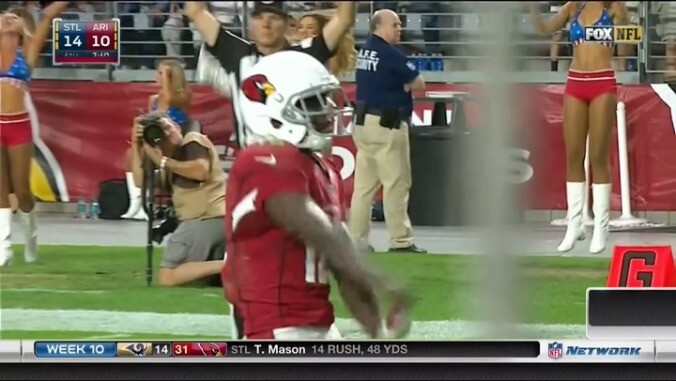
The visual hagiography can get rather thick, like in this virtual techno-shrine to Green Bay Packers quarterback Aaron Rodgers, but it could be worse. Look at the kind of garbage Fox is willing to throw out there:
Motion-blurred chalkboard letters, Fox? Christ.
My favorite NBC graphics are the player profiles that splash across the screen on a bright white background, such as the Clay Matthews number at the top of this article. They look like the motion-graphics equivalent of a foil-embossed Topps card. Football broadcasts rarely make use of a white backdrop like this, as it can overwhelm the viewer’s eyes. But employed sparingly, it really elevates NBC’s aesthetic. The autograph is a cool flourish, too. Direct your eyes toward the lines of text near the bottom, though. Although it’s just visual noise at first glance, it looks like there are actual words there! Let’s use Block & Tackle’s image-enhancement technology (a computer) to get closer.
It’s tiny, but you can barely make out “THE NATIONAL FOOTBALL LEAGUE (NFL) IS A PROFESSIONAL AMERICAN FOOTBALL LEAGUE COMPOSED OF 32 TEAMS…” and so on. Yup, NBC just pasted the first paragraph of the NFL entry on Wikipedia in there. Every Sunday night, the network subliminally televises this paragraph to an unsuspecting public, in an apparent attempt to indoctrinate those who are not already fans of the game. “If you’re not aware of the NFL, here’s a quick primer that will work its way into your mind while you sleep.” Copy-pasted Wikipedia articles: the last frontier of sports marketing.