It’s spare, eerie, and perfectly in line with the series’ playful strain of throwback horror, but it almost wasn’t so.
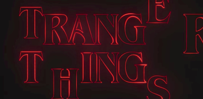
As Vulture recently revealed, we almost ended up with something a whole lot more Black Mirror. Their brief look into the creation of Stranger Things’ title sequence reveals just how committed series creators Matt and Ross Duffer were in capturing the perfect flavor of ‘80s genre, eschewing a handful of more modern typefaces (MT Light 8 and Avantgarde Futura, if you’re curious) as well as an even more chunky, retro one before landing on the logo we all know and love. According to the piece, creative studio Imaginary Forces’ early mockups didn’t work because they were trying to evoke “today’s take on the ‘80s” rather than the actual ‘80s. Obviously, Stranger Things is today’s take on the ‘80s, but getting the tone just right meant that no modern influences could worm their way in.
The sequence truly unlocked when the Duffers brought them the perfect font, which the Duffers and Netflix were already using internally. And then, finally, came the final ingredient: that bleary, cathode-ray red, according to their creative director Michelle Dougherty:
“I remember feeling, Okay, we’re kind of in this blue world,” Dougherty said. “But I really love the color red. There’s something about it that calls the attention. It also make your heart palpitate a little bit. We thought it was really appropriate. It’s funny because I recently heard a podcast with the composers who created the music [Austin-based band Survive] and they said they actually put a heartbeat in the music. It was interesting because the red makes your heart palpitate, and the heartbeat was the base of that music. So the two work really well together.”
See some more of the original mockups over at Vulture.