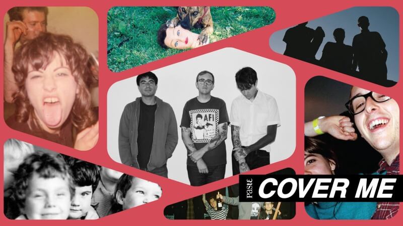
How Joyce Manor mastered the art of the “buddy” album cover
Cover Me: Barry Johnson, Matt Ebert, and Chase Knobbe dive into the stories behind the Torrence emo band’s album artwork, including that of their newest LP, I Used to Go to This Bar.
Cover Meis a column highlighting the stories behind great album covers, as told to Grant Sharples by the artists and bands who made them.
Nearly every one of Joyce Manor’s album covers contains what the California trio refers to as a “buddy” quality photo. On their self-titled, there’s a picture of five children, a photograph taken from frontman Barry Johnson’s grandfather’s archives. Never Hungover Again prominently displays bassist Matt Ebert with Hop Along’s Frances Quinlan draping their arm over his shoulder. The emo band even includes Cody in that mix, given that the dog on its cover has one paw keeping the mannequin’s head in place so that they can happily chew on it.
I Used to Go to This Bar, the seventh studio album from Johnson, Ebert, and guitarist Chase Knobbe, doesn’t explicitly portray someone resting an arm on their pal’s shoulder. But the “buddy” quality is undeniably present. It’s a photograph of the grandmother of Johnson’s and Knobbe’s tattoo artist. She’s at a house party, sticking her tongue out, with a cigarette hanging from her hand, while someone lingers in the background, out of focus but also smoking.
When I ask the band why they felt this photo reflected the songs on the album itself, Johnson quips that it connects to “every song we’ve ever done,” eliciting light laughter from his two bandmates and himself. It may be a tossed-off remark, but Johnson hits the nail on the head. At its core, Joyce Manor captures the warm comforts of friendship and the ways in which community insulates you from the world’s looming perils. Their buoyant, brisk music plays like a late-night hangout with close friends, so it only makes sense that so many of their LP covers would evoke a similar feeling.
I spoke with Johnson, Ebert, and Knobbe about the “buddy” quality of their artwork, almost naming their second album “father’s rights,” how Knobbe learned to be comfortable with his face on the front of Never Hungover Again, and the original, burrito-themed cover for 40 oz. to Fresno. Here is the story behind every Joyce Manor album cover. This interview has been edited for length and clarity.
******
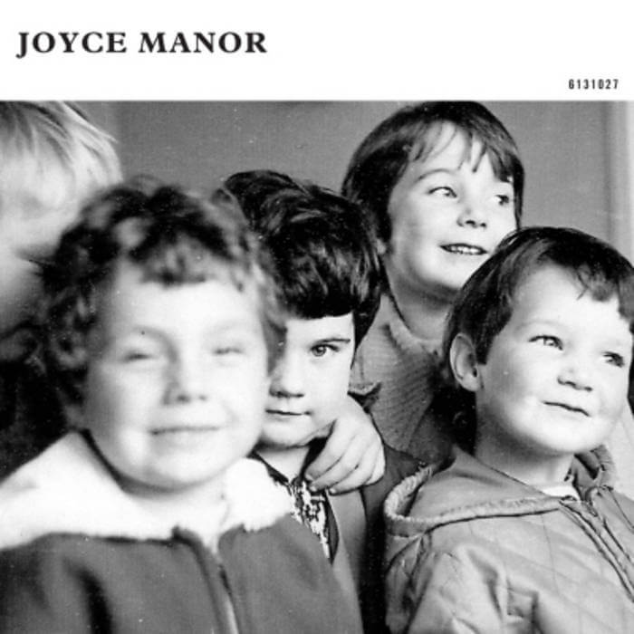
Joyce Manor (2011)
Barry Johnson: We started out strong. I had that photo, and it just looked like an album cover to me, very much iIn the vein of the Smiths or the band Fucked Up. There’s this kid in the middle that’s making very direct eye contact. It just kind of pulls you in. A couple of interesting facts about it: It’s all girls, except on the very far left.
Matt Ebert: As a side note: When we were talking about album art for that one, we were on tour and we were staying in our friend’s house in Santa Cruz, and Barry showed us that photo, and I was like, “Fuck, that is such a goddamn good album cover,” and it’s still my favorite of our album covers to this day.
Johnson: I didn’t know if it was just me who liked it, or if it would really resonate with other people. Those were early days. I feel like people have probably put out albums with horrific album covers that they’re like [nods and smiles] “yeah, that’s it!” I just thought it was an amazing picture. They’re all girls, except the very far left, there’s this blonde kid. That’s a boy, but the four main people in it are all girls, and they look like skinheads to me. It just looks extremely British. It is British.
One of the people is a member of my family. My grandpa went back to England, and he just showed up to this house where he used to live, and he knocked on the door. He’s like, “Hey, I used to live here for a long time.” And they were like, “Oh, no way. Come in!” They invited him in. He found a box of old stuff, like a bunch of pictures of his kids playing with the neighbor kids. So he brought them back. He’s like, “Check out these pictures from, you know, jolly old England.” I saw that picture, and I was like, “Damn, that’s the one.” Our friend Scott Arnold helped us lay it out, and he had this book of Blue Note jazz album covers with different kinds of layouts, text formatting and stuff. We took some stuff from that, and we put the album serial code on the cover and track listing on the front, which is pretty fancy stuff.
Paste Magazine: It does kind of have that Blue Note jazz feel, which I never really thought of until you just mentioned it.
Ebert: It felt like kind of a risk, because it was on a hardcore label, and it was really different from what bands were doing at the time. And it did feel like a scary risk to do an album cover that looked like that, but I thought it ripped.
Johnson: I think that kid in the middle is looking right in your soul, yeah, and the kid that’s all out of focus in the front is just like… Yeah, I don’t know. I think that someone got in touch and was like, “I’m one of the kids.”
Chase Knobbe: That’s awesome.
Johnson: Yeah, they didn’t sue us, thank God. But it was fairly early on, and some people think it’s us. Yeah, weird and insulting.
Knobbe: How old does this guy think we are?
Johnson: We’ve known each other since middle school, but not since we were babies.
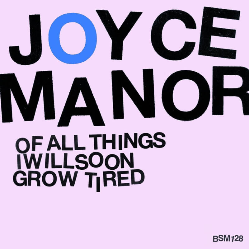
Of All Things I Will Soon Grow Tired (2012)
I read that this is a reference to the Germs.
Johnson: OK, this one’s kind of a long story too, but the album was originally called Father’s Rights. It’s a weird inside joke. We saw a sign that said, “Is it father’s rights?” And I just thought that was really funny. It’s a legal billboard kind of thing, like a trustee lawyer or something. This made me laugh. I don’t know why. The girl I was dating at the time drew this burnt-out, stoned-looking hippie girl. And I was like, “That’s pretty cool.” And then I had her do a groovy font that said “father’s rights” with this burnt-out, stoned hippie. And I was like, “That’ll work!” I sat with it for a while, and people asked me, “What’s the new album gonna be called?” And I would tell them, “It’s called Father’s Rights. It’s got this drawing of a hippie girl on it.” Nobody responded well to that; it wasn’t like the first record. People weren’t like, “Yo, banger photo. Love it.” They were like, “Are you OK?” So that got old.
We met up with the designer who did the first record, and I could just tell he was pretty bummed on it. So that didn’t go well. I went home, and I was kind of like, “All right, maybe there’s a song title we could use instead of ‘father’s rights.’ Let’s just get rid of that.” None of the song titles worked. But then I was going through the lyrics, and I came across “of all things I’ll soon grow tired.” And I was like, “That’s pretty cool. I like that.” I really relate to that sentiment: getting over stuff. But it didn’t really go. We tried it with the hippie girl. We added this rainbow, and it wasn’t working for me. Out of frustration, the guy who designed our first record started messing with it. We had the pink background already, we got rid of the hippie girl, and then he blew [the text] up all big because I had cut out that Helvetica and made it all like Devo, the letters all crooked and stuff. He just blew it up all big and made it the main thing. I was like, “make the O blue.” But I honestly wasn’t really thinking about the Germs, but I knew I liked a blue O. And I like the Germs. It’s subconsciously ripping that off. Immediately, I was like, “Oh yeah, it’s like the Germs.” It’s an homage.
So it was completely unintentional?
Johnson: For about five minutes. [laughs] I liked how it looked, and that was good, that was covered. Everything with that album was done out of frustration. Things weren’t going well, and then you fuck it up and slice it up and chop it up and that’s it. So the album cover matches, I think, the feel of that record: kind of disjointed and distressed. We recorded that record twice. We ended up using demos and made things fucked up and weird on purpose, because they weren’t going that well. The first record was so easy. It was basically just our live set; the songs worked already. We went in and knocked them out. And we’re like, “Awesome.” And then, for whatever reason, the second record was really difficult to get to work, and the same thing with the cover. I had a weird title and a weird idea for the cover that no one was really feeling, including myself.
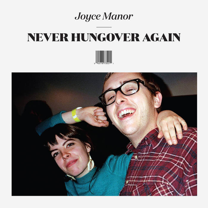
Never Hungover Again (2014)
So Matt, this next one, you’re the co-star with Frances from Hop Along. What are the origins of this photo?
. Ebert: Barry really liked that one. It was taken backstage in like 2012. I don’t remember what we were thinking about for the cover before. Do you guys remember?
Johnson: Yeah, it was a picture of us in the studio.
Ebert: Oh, right. And this was toward the end of production, when everything was almost done, and then Barry was like, “hey, I really like this picture. I think it’s got to be the cover.” It took me so long to even be OK with using it, and then several years after that for me to actually realize that I really like it, just because, especially at the time, I was not interested in being the center of attention and having my face on a fucking album cover. It was a tough adjustment for me, but one that I’m really glad we did, because I really like it now.
Johnson: Yeah, our friend Ariel [LeBeau] took the photo, and I really liked the photo. We were just trying to figure something out for the cover. Matt said, “No, I don’t want my face on the album cover.” Chase and I are like, “But, yeah?” Matt was like, “Dude, no.” And I was like, “But, yeah.” [laughs] You really had to be coaxed.
Ebert: What does it matter? At the end of the day, I was like, “Who cares, what does it matter?” And then, of course, it ended up being our most iconic record. [laughs] We recently did the Never Hungover Again anniversary shows, too. We had a bigass backdrop that was just the album cover. So it was kind of like exposure therapy or immersion therapy, and I didn’t ever notice until it was blown up on a backdrop that there’s a fucking piece of food in my teeth. It was on bus benches and billboards, and my parents and my grandma are taking pictures with it and shit.
You were uncomfortable with it at first, but how did Frances feel about it?
Ebert: I don’t think Frances ever really cared that much.
Johnson: I think they were down. And I think it’s also kind of weird to feature somebody from another band on your album cover, but I definitely thought it was a cool move. Has that been done before by another band? Maybe the Glocca Morra album [Just Married]. Tom [May] is on it. Maybe I was not weirded out by that because of that. I remember Brett [Gurewitz] from Epitaph was like, “Why don’t you have a picture of the whole band? Why are you putting someone from another band on your album cover?” But I was like, “You don’t get it, man. It’s just friends hanging out.”
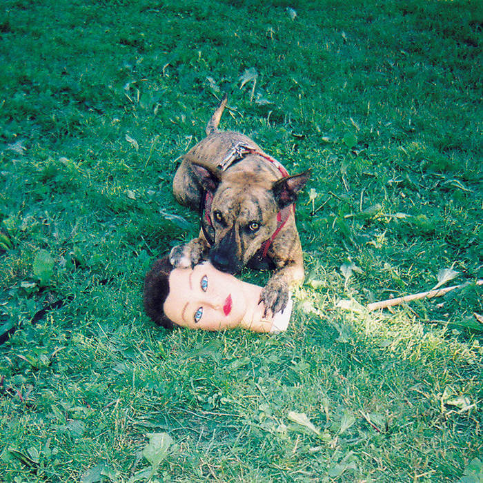
Cody (2016)
The first thing I want to know: Whose dog is that?
Johnson: So, my friend is a photographer from Minneapolis called Adam DeGrasse. He actually tours with Post Malone. He would take punk photos in Minneapolis, just people wearing spiky shit. That was a lot of his photos at hardcore shows, and he posted that photo. We already had an album cover and turned it in. Everything hadn’t been made yet or actually been manufactured, but it was turned in, and the record was called Three Potted Plants. It was a drawing of three potted plants. It was a lot less cool. I saw the photo, and I was like, “Fuck, never mind. We got to use that.” And I wrote to him, and I said, “Hey, can we use this photo for the album cover?” Patty [Costello] from Dillinger Four had just written him the exact same thing. He didn’t want to use it for Dillinger Four, but he has another band called Butcher’s Union that he was going to use it for. And he’s like, “Let me ask Patty if you can have it instead.” Patty’s so nice. He let Joyce Manor have it. The dog’s name is Cheesecake.
Ebert: Yeah, I think he was in his friend’s backyard, because we’ve seen some other photos of Cheesecake, who would be very old now if not in Heaven. But Cheesecake is awesome, and I love the photo. It’s such a great photo.
Johnson: Again, Scott Arnold, same thing, was like, “Are there other photos from this series?” And I was like, “Who cares? Just use the one. It doesn’t matter. Like, that’s such a great photo.” Then I had to ask [Adam], “Hey, do you have other photos?” He’s like, “Yeah, I have a few,” so on the center labels, it’s a couple seconds later, and the dog’s chewing on it or something. But again, this one has the arm around Cheesecake, his paw on the thing, and the eye right in the middle, looking at you, kind of like the first record, and it’s a disposable photo camera, so it’s pixelated in a way that you can blow it up and it looks fuzzy and not like little squares. It’s almost impressionistic. It’s cool. I love that one. That’s my favorite album cover.
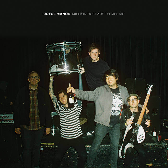
Million Dollars to Kill Me (2018)
Johnson: It’s on stage at the Phoenix Theatre in Petaluma, which is a pretty legendary California spot. We’re AFI super fans, so the song “The Days of the Phoenix” by AFI is about that place. That was cool.
Ebert: That one has our friend Chad on the cover, who’s a really old friend of ours and has toured with us a lot. He’s like that nice friend from high school. For a long time, we had one crew member, and it was just Chad. He did merch, and he’s really funny, and I like that.
Knobbe: He’s holding my guitar in it, too. It’s a really silly photo, like Barry holding the kick drum or floor tom.
Johnson: I’m holding up the VISTA light clear kick drum over my head, and Chase is hammered, holding a bottle of champagne.
Ebert: I look like a fucking 13-year-old with a backpack on. [laughs]
Johnson: What’s funny is I sent this to Scott Arnold, who did all the album covers up until this point, and, and he’s like, “Do you wanna use any other pictures? Is Matt cool with this?” Matt had no reservations about this one. On the front of Never Hungover Again, where he looks really infectiously happy and cool, he was like, “I don’t know, man,” but this one where he’s, barely in focus…
Ebert: I got my boys!
Knobbe: You look shopped in, but you’re not. That one really feels like the time of the band that it was, which was… it was an OK time. We were maybe a little bit beaten down by the road. We were touring a lot, but it was fun. It was a haze of a lot of drinking and just getting through it. The back cover is cool: it’s our drummer flipping off the camera, in a really nonchalant way, and it’s a set list and a bottle of champagne gets passed around. I always thought it was weird. I could have been holding the champagne bottle in front of Barry’s face or something.
Johnson: Our buddy Hans took this photo. He was at the show, and he just snapped it. He grabbed props really quick. There is a lot of product placement. There’s an Orange amp. There’s this brand of champagne I can’t quite read. There’s a Rickenbacker. There’s a very clear Adidas shoe. Muchos product placement.
No sponsorships came about, though?
Johnson: Oh, we get paid for all of it. We get paid. [laughs] Checks every week!
40 oz. to Fresno (2022)
Johnson: So this is not the original album cover. A bunch of [original] covers were physically printed. We took band photos for when the album was gonna come out, and that was when it didn’t come out. This was during the pandemic. We started fulfilling our own merch. If you order merch from us, we pack it up and ship it to you. It was a nice little way for us to supplement our income. Since we couldn’t tour and we were together doing that when we got the photos that we had taken for the press cycle, we were going through them, and that one came out, and it was a mistake. But the photographer, Dan Monick, who’s taken basically all of our album press photos, included it anyway because it was cool-looking. I was like, “Fuck, that would be such a cool album cover. I wish we had this before I submitted [a picture of] me eating a burrito while insanely hungover that my wife took on her iPhone.”
You could’ve called it Hungover Again.
Johnson: It was, actually! That’s so funny. But that all just seemed a bit too jokey. But everything kind of felt like a joke. During the pandemic, it was hard to take anything seriously. But I sent it to Brett in a text, and I was like, “Yo, is there any way we can just change the album cover?” He really liked the photo, but he was like, “Yeah, we can do it. We can figure it out.” And then I told Matt McGreevy, another guy at Epitaph, and he was like, “Nah, man, it’s too late. They’ve already been printed.” And I was like, “But Brett said we can.” And he’s like, “Brett’s wrong.” Then I asked Jeff Abarta, who’s in charge of the product stuff, and he was like, “Yeah, they’ve already been printed. It’s so wasteful.” And then I was like, “Let’s do a limited number of the original covers, and then we’ll recycle the rest of them.” I went to Brett, and he let me change it. Then we had the burrito one. We made them this limited thing.
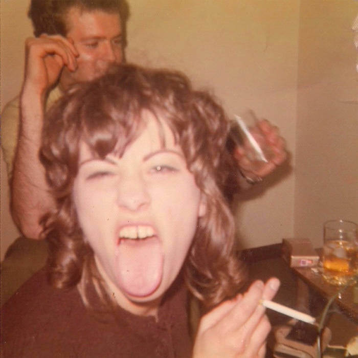
I Used to Go to This Bar (2026)
Johnson: Our buddy who’s done a lot of Chase’s and my tattoos, Chris Clean, posted it on Instagram, and I assumed it was somebody from a famous band. I thought it was a picture of someone from a death rock band. I don’t know why. I just thought it was a cool picture of somebody from a band that was around in the early ‘80s, but a very candid photo of them that looked really cool. I liked the photo so much that I was just curious who it was. I was like, “This is awesome. Who is this?” And he was like, “Oh, it’s a photo of my grandma. She just passed away.” And I was like, “Oh, dude, I’m so sorry to hear that. But she really looks like an absolute legend.”
I let a little time go by, and I was hesitant and nervous to ask if we could use it, because I didn’t want to offend him. Maybe it’s rude to be like, “Hey, I really like this photo of your grandma who passed away. Can I use it for an album cover?” But he was super into the idea and really, really pumped on it. This is actually one of the few times where, maybe since the first record, there was no discussion of a different album cover. Once we saw it, I was like, that’s the cover. It didn’t vary at all.
Ebert: Everyone really liked it instantly.
Johnson: And we knew the title. We already had the song “I Used to Go to This Bar.”
Why do you feel like this particular photo connects to these new songs?
Johnson: I feel like that photo kind of connects to every song we’ve ever done. [laughs] It’s just an awesome photo. It’s a party pic, and there’s cool little details around the background.
Ebert: I like that it looks really timeless, like it could be from any era.
Johnson: We don’t really have two album covers also with the same color scheme, which I really like. It’s kind of like a Weezer thing, you know? The first one is a gray album, pink album, then the white album, then the green album, then a blue album. This one’s the beige album. I like whatever pack of cigarettes those are. I like this whiskey glass. I like this hammered dude in the background. It doesn’t really have an arm-around-the-shoulder thing, but it’s just a great photo. And there are cigarettes indoors. Cigarettes indoors are just insane and awesome.
I Used to Go to This Bar is out 1/30 via Epitaph.
Grant Sharples is a writer, journalist and critic. His work has also appeared in Interview, Uproxx, Pitchfork, Stereogum, The Ringer, Los Angeles Review of Books, and other publications. He lives in Kansas City.