The great Oscars fuck-up of 2017 is a lesson in the importance of typography
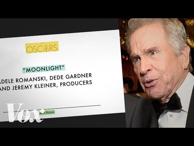
The great Oscars fuck-up of 2017 is a lesson in the importance of typography

Hey, remember when Warren Beatty and Faye Dunaway announced La La Land as Best Picture winner at the Academy Awards, but then it turned out La La Land wasn’t Best Picture and Moonlight was? We quickly found someone to blame, but a new video from Vox credits the mistake not with a single person, but rather a failure of design. A typographical design, to be more precise.

By analyzing the design of the card, the video details how a simple reorganization of information could have easily prevented the error. Humans read top to bottom, after all, and font matters, so why is extraneous text so often situated up top and in the same size as the relevant information? The same logic is applied to the design of the Miss Universe card that Steve Harvey misread back in 2015, as well as Florida’s ballots during the 2000 election, which confused countless voters and undoubtedly had a huge impact on the results.

The most interesting takeaway of the video, however, is how these concepts can benefit prescription pill bottles and, presumably, prevent accidental deaths. Watch the entire thing below.

As for Hidden Fences and Adele Dazeem? No amount of typography can fix those fuck-ups.

 
Join the discussion...