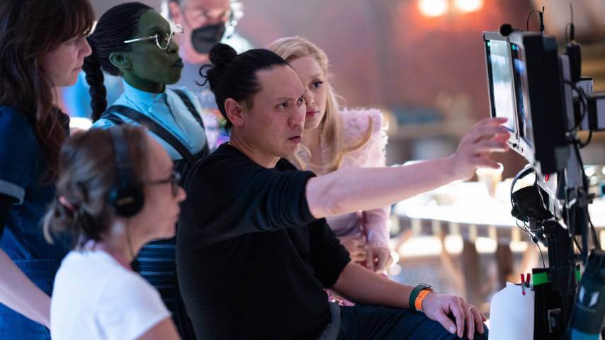
Apparently Wicked’s muted colors make it more like our desaturated reality
Wicked director Jon M. Chu explains that he wanted viewers to “feel the dirt” of Oz.
Photo by Giles Keyte (Universal Pictures)
Wicked has clicked (or should we say Glicked—no, we shouldn’t) with moviegoers, defying gravity to an estimated $114 million domestically. That’s enough money to poo-poo any criticisms about the movie looking pretty drab, an issue shared by The A.V. Club. In his review, critic Jesse Hassenger found the film’s color grading ranked among its most significant problems. “Dim contrast, washed-out pinks and greens, and the kind of overall white-haze overcast look that renders images clear but utterly muted,” Hassenger writes. “Most of [Wicked] still looks like those Marvel movies they shoot in Georgia parking lots.” Hassenger wasn’t the only viewer disappointed by Wicked toning down The Wizard Of Oz’s Technicolor bravado. It was enough of a complaint that The Daily Globe And Mail told director Jon M. Chu that the movie was “a little desaturated.” Apparently, that’s the point because color doesn’t exist in reality.
 Keep scrolling for more great stories.
